Peaceful pomodoro
Overview:
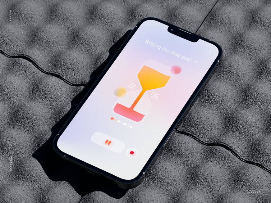
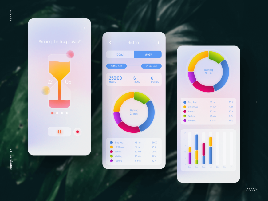
The peaceful Pomodoro app is a time management tool inspired by the hourglass. With a soothing color palette and a minimalist interface, this app combines the functionality of a Pomodoro timer with a simple task manager. Users can easily track their work sessions, set timers, manage tasks, and visualize their productivity with intuitive charts and graphs. The app's focus on user experience, aesthetics, and functionality makes it a perfect companion for staying focused and organized throughout the day.
My Role: Product Designer
Usability
Visual Hierarchy
Interaction Design
Tools: Figma, Paper & Pencil,
FigJam
Aesthetics
App

The app employs a soft color palette with gradient backgrounds that evoke a sense of calm, aligning with the "peaceful" aspect of the app. The choice of colors is not only visually pleasing but also helps in differentiating between different tasks and statistics.
The use of modern, sans-serif typography contributes to the app's clean and minimalist aesthetic. The font sizes and styles are varied to create a hierarchy of information, making it easy for users to identify the most important elements on the screen.
The hourglass is a central visual element in the timer screen, serving as a metaphor for the passage of time. This not only adds to the visual appeal but also reinforces the app's purpose as a time management tool.
Typography
Visual metaphor
Minimalism
The design avoids clutter by only presenting the essential elements required for functionality. This minimalism helps users focus on their tasks without being overwhelmed by too many options or information.
Contact me.
For collaboration, design discussion or for a simple
